MwareTV brand book

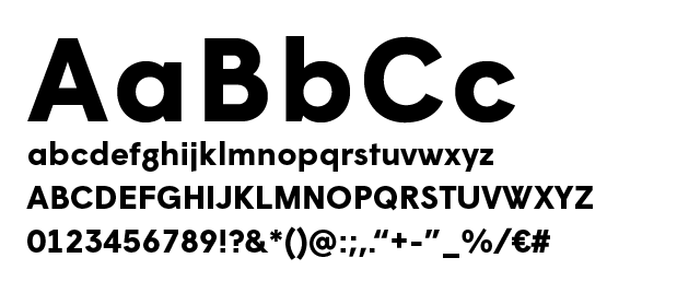
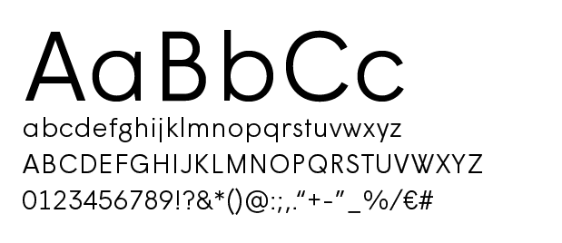
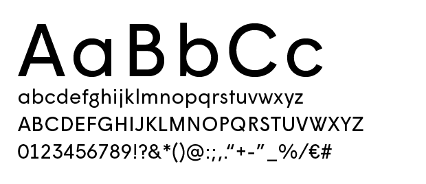
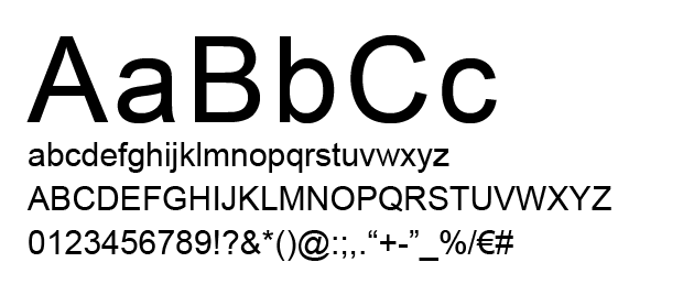
A uniform corporate identity contributes to a visible and recognisable MwareTV. Within the corporate identity, there are several features that define the look: logo, typography, use of colour, photography and language. This manual shows the building blocks that a designer and copywriter can use to create resources as they see fit.

Questions?

This corporate identity was developed by ZUID Creatives. To find out more about the corporate identity, you can contact us by e-mail: info@zuid.com or call (+31) 13 545 03 23.

The MwareTV logo

MwareTV figurative mark

The figurative mark is a characteristic form of MwareTV.

An ‘M’ and a ‘W’ balanced within the triangular shape, derived from a Play button, with curves for a smooth look and feel and association with cloud services.

Figurative mark in colour on white or light-coloured background

Figurative mark in colour for diapositive use on dark-coloured background

Figurative mark in black on white or light-coloured background

Margin

Make sure there is enough space around the logo. Never place text too close to the logo. A minimum margin has been determined based on the triangle (which is the starting point of the figurative mark) and the vertical centring of the letters ‘mware’.

Don’t distort or rotate

For the sake of recognition, the logo or figurative mark must not be distorted. Colours should be preserved as well. Do not invert, mirror, rotate etc. or change text.

Typography

Wigrum Bold

For use in headlines and highlighted text.

Wigrum Light

For use mainly in subtitles and separate, short sentences, etc.

Wigrum Regular

For use in longer text (body copy) and neutral text. Wigrum is an extended font family. Variations may be used for accents and exceptions, but try to limit it to the use of regular, bold and light.

Arial

The font to use, in correspondence where standard fonts must be used.

Colours

The lilac featured in the figurative mark is the most characteristic colour for MwareTV. Make sure the colour balance is even. White space is also important for the visual identity. It creates calm and freshness within a layout.

Lovely lilac

The most characteristic colour for MwareTV. For graphic elements, increasing attention value in headlines, calls to action, etc.

HEX: #485FE0
RGB: R 72 / G 95 / B 224

CMYK: C 81 / M 65 / Y 0 / K 0

Deep purple

A dark support colour. For general and more neutral use. Creates a strong contrast with white or lighter colours.

HEX: #1D0071
RGB: R 29 / G 0 / B 113

CMYK: C 100 / M 98 / Y 27 / K 17

Bright green

Contrasting colour to distinguish between functional elements.

HEX: #14C6CC
RGB: R 20 / G 198 / B 204

CMYK: C 68 / M 0 / Y 26 / K 0

Functional yellow

Signal colour to give calls to action and graphic elements extra attention value.

HEX: #FFCB00
RGB: R 255 / G 203 / B 0

CMYK: C 0 / M 21 / Y 93 / K 0

Based on the general colours

A flowing transition between the three colours, creating a gradient from deep purple to bright green. The gradient becomes extra dynamic when used as an overlay effect over the hexagon pattern or over an image.

Styling elements

A shape of a play button is a triangle, which forms the basis for the figurative mark. And the diagonals are taken as a stating point for creating shapes. Ideally the same angle (of 30 degrees) is used. But depending on a layout or space other angles can also be used for a better fitting.

Triangles with rounded corners. Especially for playful use as outlines and for a light-hearted layout, or for filling with images. Of course, this should be the same triangular shape with diagonals as in the basis of the figurative mark.

The geometric pattern is created on a base of triangles (which is inspired by a play button icon) and can be used for backgrounds en shapes. In base the pattern is build in shades of grey. In a layout the pattern gets a color overlay with the gradient in multiply mode.

Photography

Complete portrait photos. High-resolution copies can be found in the downloadable pack.

Portrait photos in the form of a circle, e.g. to be used in an email signature.

Layout

A few examples of resources (concept)

Copy style guide

A style guide that makes writing a lot easier

Why a copy style guide?

This style guide gives you a grip on MwareTV’s written communications. Refer back to it every once in a while. That way, you can be sure that everything you write is still fully MwareTV-compliant.

Tone-of-voice

First things first: all of Mware’s communications must be in native English. The target group is 99 per cent international, so it is important to use flawless American English in every communication. In addition, we borrow a number of elements from the previous brand voice to set the tone for Mware – literally.

Mware has a Dutch character, with a non-Dutch ambition. The brand is helpful, down to earth and realistic. See it as a good neighbour who is always willing to help. Mware is informal and human, but always stands for quality and innovation. That combination will make the difference in future communications. By being both practical and considerate, we ensure that Mware’s established professionalism can be felt in every communication.


“The moment digital takes over and human interactions diminish, the human touch becomes a premium.”
(When Digital Becomes Human – Steven van Belleghem)

Spelling of the company name

MwareTV
That is to say: with capital letters M and TV.

The basis of a good text

Formal or informal?
Informal. We want to communicate with the target group as equals. If you use formal language, you create an unnecessary distance. In order to get as close as possible to our target group, we address everyone by their company name or by informal pronouns. The aim is to achieve a good mix. Side note: there is no difference between formal and informal pronouns in English, of course, but there may be in other languages that we might want to use in the future. That is why this is included in the style guide as a standard rule.

Use of the company name
MwareTV is always written with a capital M and capital TV, so in addition to the beginning of a sentence, the first letter is also capitalised in the middle and at the end of a sentence. This is because names always begin with a capital letter.

Abbreviations
As we take the time to reach our target audience, we write out abbreviations in full. This is a small effort, but it looks nicer and reads better.

Positive language
Avoid the unnecessary use of words with negative connotations, such as ‘not’, ‘never’, ‘none’ and ‘but’. Our communications must leave a positive feeling.

Active voice
Avoid phrases with auxiliary verbs, so that you are clear and personal.

Write out the following numbers in words:

  • Whole numbers below twenty, multiples of ten up to one hundred and multiples of one hundred up to one thousand. This means we write numbers as follows: eighteen, 22, forty, 103, two hundred, 250, three thousand;
  • One thousand, one hundred thousand, one million and one billion. Combine these numbers with a space: ten million, 123 million, two billion.

Two exceptions:

  • Use digits for precise information such as measurements, temperatures, ages, years, page numbers, percentages and monetary amounts (3 grams, 16 years and so on).
  • If a text contains both numbers that should be written out and numbers that should be written as digits, use digits for everything.
  • Does the text have a good structure?
  • Is the layout clear?
  • Have you used headings where appropriate?
  • Is your text written in the active voice and specific?
  • Does the text not raise any new questions?
  • Have you used contemporary language?
  • Are your sentences short and simple?
  • Is your text understandable, complete and relevant?
  • Will you achieve your goal with this text?
  • Is your text a call to action?
  • Does your own text appeal to you?